This guide organizes 35 bathroom cabinet paint ideas from the most timeless basics to the boldest statement colors, helping you find the right shade for your style, space, and confidence level.
TLDR
- Neutral shades like white, cream, gray, and beige work everywhere and protect resale value
- Nature-inspired tones — sage, olive, warm wood — bring spa-like warmth to any bathroom size
- Bold colors work best in powder rooms or as intentional statement pieces with coordinated hardware
- Semi-gloss or satin finishes resist moisture and wipe clean
- Cabinet color works best when matched to your bathroom's size, lighting, and existing tile tones
Neutral & Classic Bathroom Cabinet Paint Ideas
This category covers the foundation of enduringly popular choices — colors that work with virtually any tile, hardware, or wall color and age beautifully with changing trends. According to the 2025 U.S. Houzz Bathroom Trends Study, white remains the most popular painted vanity color at 20%, followed by off-white (10%) and gray (9%).
White & Cream Tones
Crisp bright white is universally flattering — it reflects maximum light and makes small bathrooms feel larger. Use it with chrome or polished nickel for a spa aesthetic, or matte black hardware for contemporary contrast.
Warm whites and off-whites (think Sherwin-Williams Alabaster) have creamy undertones that suit bathrooms with limited natural light. They complement beige or tan tile and work especially well with brass or unlacquered hardware.
Cream and ivory add warmth without the clinical edge of pure white — a natural fit for vintage or traditional bathrooms with stone countertops. Benjamin Moore Classic Gray OC-23, despite its name, reads as a creamy off-white with subtle violet-pink undertones.
Gray & Charcoal Tones
A few things to know before choosing a gray:
- Slate gray suits contemporary bathrooms with white subway tile and quartz — calm and modern, it reads sophisticated without going dark. Pair with polished chrome.
- Charcoal is bolder than gray but more wearable than black. It anchors a bathroom with strong contrast against white tile or marble; brass or brushed gold hardware adds warmth.
- Greige (half-gray, half-beige) bridges cool and warm palettes, making it easier to coordinate with existing tile. It reads warmest under incandescent or warm LED lighting.
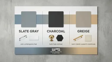
One critical note: gray paint is highly sensitive to lighting — the same gray can lean cool (blue undertones) or warm (beige/brown undertones) depending on your bathroom's natural and artificial light. Always test a sample before committing.
Beige & Taupe
Beige ranges from warm pink-toned to sandy khaki. The key is to echo the undertones in your countertop or tile — beige that fights with adjacent surfaces will read muddy rather than warm. It creates an organic, grounded foundation for bathrooms with natural stone elements.
Taupe is deeper and cooler than beige, making it a strong choice for bathrooms with tan or brown tile where pure gray feels too cold. It adds quiet depth without drama.
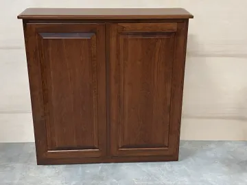
Classic Black
Black is a timeless, confident neutral — and not just for modern spaces. Matte black suits warm, editorial looks when paired with wood accents or brass hardware; glossy black reads sleeker and more contemporary.
Extending the color to open shelves or a linen cabinet creates a cohesive, intentional feel. To keep the space from feeling heavy, pair matte black cabinets with natural materials — wood shelving, stone countertops, or warm-toned tile all help balance the weight of a dark finish.
Natural Tones & Earthy Hues
These colors bring the outside in — organic, grounding, and increasingly popular for spa-inspired or biophilic bathroom designs. They sit between neutral and colorful, making them a great entry point for homeowners wanting personality without going too bold.
Wood Finishes: Light, Rustic & Dark
Light Natural Wood Spa-like and calming, light natural wood pairs with warm whites and minimalist decor. According to the NKBA 2026 Bath Trends Report, wood-faced vanities (62%) have overtaken painted vanities (53%) in popularity as biophilic design continues to dominate.
Rustic or Mid-Tone Stained Wood Mid-tone woods like walnut or oak occupy a sweet spot: warm enough to feel inviting, neutral enough to work with almost any wall color. They add richness without darkening the space and complement both contemporary and traditional tile.
Dark or Blackened Wood Moody, dramatic, and high-contrast against lighter walls or wallpaper. The quality of the wood grain matters — custom-built cabinets with premium hardwoods hold stain and finish treatments far more evenly than lower-grade particleboard, resulting in a richer final look.
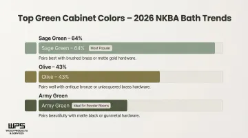
Sage, Mint & Gray-Green
Sage Green The most universally popular green right now. Sage (64%) dominates green bathroom choices in the 2026 NKBA report. Warm, earthy, and spa-like, sage pairs beautifully with brass hardware and white walls. Behr's 2026 Color of the Year, "Hidden Gem", is a smoky jade green recommended for bathroom vanity cabinetry paired with warm brass fixtures.
Mint Green Lighter and airier than sage, mint brightens small bathrooms and pairs best with white tile or chrome hardware. It reads cheerful without being overly bold.
Gray-Green More muted and complex, gray-green pairs beautifully with natural stone countertops and a neutral palette. It's sophisticated enough for contemporary spaces but organic enough to feel calming.
Earthy Darks: Army Green & Olive
Army Green Deep, moody, and rich — ideal for powder rooms. Olive (43%) follows sage as the second most popular green choice in bathrooms. Army green pairs with black stone and brass hardware for a designer look.
Olive Modern yet warm, olive stands out in neutral spaces and complements wood accents and natural materials. Pair either shade with a warm-toned light fixture to keep the space from reading too dark.
Bold Colors That Make a Statement
Bold cabinet colors work best when they're intentional. Coordinated hardware, complementary wall colors, and good lighting all amplify the effect — especially in powder rooms, where there's less square footage to worry about and more freedom to commit.
Blues of Every Depth
Powder/Light Blue Light blue reads almost like a neutral — airy and coastal in feel. Pair with white tile and crisp chrome hardware for a clean, serene finish that works in full bathrooms and powder rooms alike.
Sky Blue A step deeper than powder blue, sky blue adds cheerful energy without demanding attention. White tile and chrome hardware keep it timeless rather than trendy.
Gray-Blue Gray-blue is popular with marble countertops and brushed nickel hardware — it reads as a soft neutral with just enough color to feel deliberate rather than safe.
Navy Blue Rich and elevated. Benjamin Moore's Hale Navy (HC-154) is a classic with balanced undertones that works across a range of hardware finishes — brass, matte black, or chrome. Navy is considered a timeless neutral option and one of the most popular "bold yet classic" choices for bathroom cabinets.
Cobalt and Royal Blue Full-commitment statement colors. These work best in powder rooms where the intensity has nowhere to overwhelm — pair with graphic tile or bold wallpaper to lean into the drama.
Periwinkle or Indigo An unexpected blue-purple hybrid that reads elegant rather than playful. Gold accents and warm lighting bring out its jewel-box quality.
Green Statements: Teal, Hunter Green & True Green
Teal Designers frequently use dark teal in powder rooms for its cozy, lounge-like quality — it's both cheerful and moody depending on the light. Teal pulls blue-green tones from tile or wallpaper naturally, making cohesion easy.
Hunter Green Deep and historic in feel, hunter green pairs well with stone countertops and vintage or mixed-metal hardware. It's part of the brown-based green trend leading 2026 bathroom design forecasts.
True or Bright Mossy Green This is not a neutral — it's a committed choice. Natural textures like rattan, linen, and raw wood keep it grounded rather than garish.
Warm Jewel Tones & Unexpected Colors
Eggplant/Deep Purple Deep purple is more wearable in bathrooms than most people expect — warm lighting and gold hardware pull out its richness rather than its heaviness. Best suited to powder rooms where the color fills a compact space.
Ruby Red or Garnet Bold and dramatic. Works well as an accent cabinet color or as the focal point in a powder room. Blue tile and gold accents push it into maximalist territory — intentionally.
Butter Yellow and Dandelion Yellow Joyful and underused in bathrooms. Yellow complements blue, green, and warm tan elements, adding energy without reading as a statement color in smaller doses.
Light Pink and Blush Blush has moved from trend to reliable staple. Paired with unlacquered brass, it reads feminine without being precious — a combination that ages well.
Bright Hot Pink The most committed choice on this list. Hot pink works in powder rooms where it fills a small, contained space — and where guests will definitely remember it.
Two-Tone, Patterned & Special Finishes
Two-Tone Cabinets Upper cabinets in a lighter shade, lower in darker. This approach adds visual depth and draws the eye upward, making ceilings feel taller. Keep hardware consistent across both colors to make the look feel intentional.
Patterned Cabinets Hand-painted or stenciled designs in lieu of wallpaper. Great for colorful detail without committing to wall coverage.
Mirrored/Reflective Finishes Reflective finishes bounce light and add visual depth — especially effective in small bathrooms where the goal is to make the space feel larger.
How to Choose the Right Paint Color & Finish for Your Bathroom Cabinets
Color selection should account for three key factors:
1. Bathroom Size and Natural Light
- Light neutrals and cool tones expand small, dark spaces
- Bold colors work best in well-lit rooms or intentionally moody spaces like powder rooms
- Lower Kelvin bulbs (2500K-3200K) emit warm light that can mute cool paint colors and enhance warm tones
- Higher Kelvin bulbs (4000K+) can make warm colors appear flat or sterile
2. Existing Fixed Elements
- Tile color, countertop material, and floor tone should inform undertone choices
- Warm countertops call for warm cabinet tones, and vice versa
- Gray and white paints shift drastically under different lighting conditions
3. Desired Mood
- Neutral/spa vs. energizing/bold
- Rich tones like espresso, graphite, and navy evoke depth and elegance
Wall vs. Cabinet Color Relationship
This is one of the most-asked questions homeowners have:
- Cabinets a few shades darker than walls within the same color family — creates depth and cohesion
- Contrasting bold color on cabinets with neutral walls — creates a focal-point effect
When a vanity is darker than the walls, it creates an anchor point, drawing the eye and enhancing architectural balance.
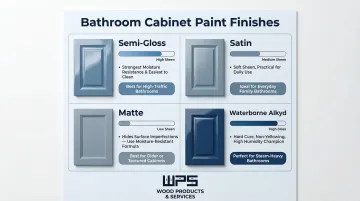
Paint Finish Choices
- Semi-gloss and satin — Most practical for bathrooms because they resist moisture, humidity, and daily cleaning. Semi-gloss provides strong moisture resistance while reflecting less light than high-gloss.
- Matte — Requires a moisture-resistant formula. Benjamin Moore's Aura Bath & Spa is a specialty matte finish built for humid bathrooms.
- Waterborne alkyds — Products like Benjamin Moore Advance and Sherwin-Williams ProClassic deliver the hard cure of oil paint with the non-yellowing properties of water-based paint, making them ideal for high-humidity bathroom cabinets.
Primer Is Critical
Whatever finish you choose, the result depends heavily on what goes on first. Use a quality primer specifically formulated for cabinets — particularly over bare wood or previously stained surfaces. Key things to look for:
- Adhesion-bonding primers for slick or previously painted surfaces
- Stain-blocking primers over wood knots or tannin-rich species like oak
- Water-based primers when using waterborne alkyd or latex topcoats (avoids adhesion conflicts)
Conclusion
Whether you want a calm neutral retreat, a nature-inspired spa, or a powder room that makes a real impression, there's a bathroom cabinet paint color that fits your vision. The key is matching color to your space's size, lighting, and existing elements.
If your current cabinets are beyond a paint refresh, or you want to build bathroom cabinetry from scratch, Quality Made Cabinets has been crafting custom bathroom cabinets for residential clients since 2010. Every project comes with a 12-month workmanship guarantee and a free post-installation check.
Frequently Asked Questions
Is painting bathroom cabinets a good idea?
Yes. Painting bathroom cabinets costs between $150 and $900, while full vanity replacement ranges from $525 to $3,360. With proper prep and quality moisture-resistant paint, a painted finish can last 5-10 years.
What is the best color to paint your bathroom cabinets?
There's no single best color — the right choice depends on bathroom size, lighting, and existing elements. Whites, grays, navy, and sage green are consistently popular and designer-approved options that work across styles.
What is the best color for small bathroom cabinets?
Light neutrals (white, cream, pale gray) reflect light and create openness. Rich dark colors in small powder rooms can also create an intentional, moody effect — especially when paired with good lighting.
Should bathroom cabinets be darker or lighter than walls?
A few shades darker than the walls (within the same color family) creates cohesion and depth. A contrasting bold color against neutral walls delivers a focal-point effect. Both approaches work — it comes down to the look you're after.
What colors make a bathroom look expensive?
Colors that consistently read as upscale include deep navy, warm black, hunter green, warm white, and charcoal gray. Finish matters too — satin or semi-gloss paired with quality hardware elevates any color.
What's the best paint for bathroom cabinets?
A high-quality alkyd or waterborne alkyd paint in satin or semi-gloss, applied over a bonding primer, is the standard recommendation. Moisture resistance and proper surface prep matter more than brand.