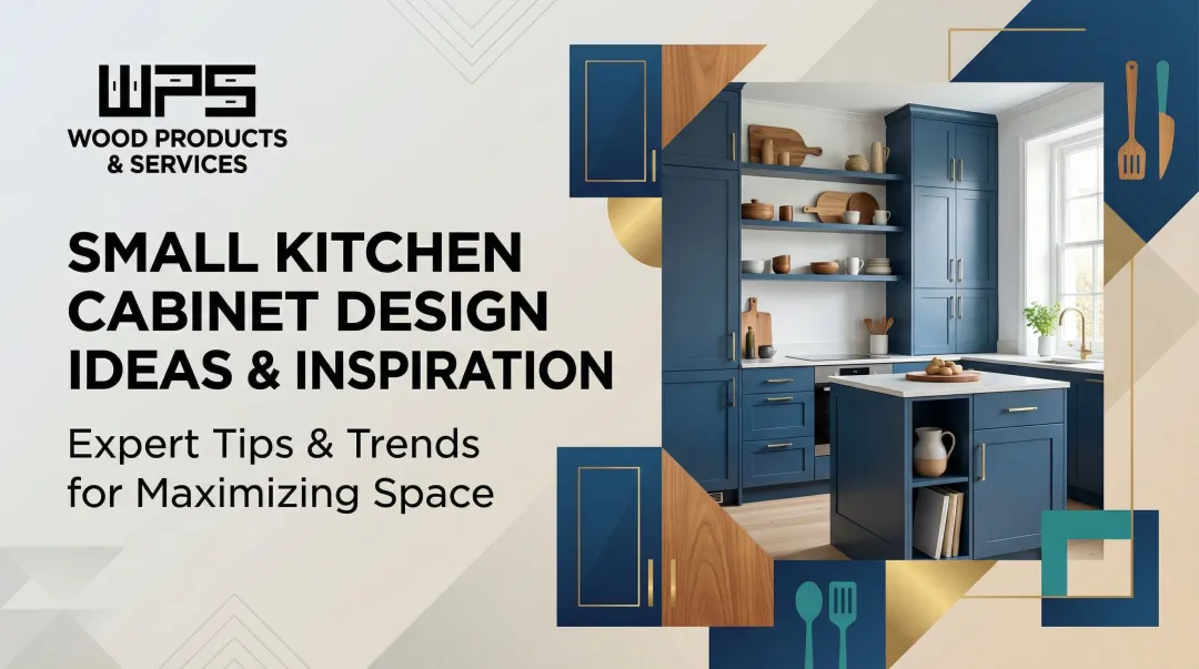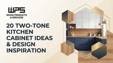
This guide delivers 20 curated two-tone cabinet color combinations organized by design style, plus the practical rules you need to make the look work in your space. You'll leave with both inspiration and a clear starting plan.
TLDR
- Two-tone kitchens pair two colors, finishes, or materials for visual contrast and a high-end, custom look
- Darker lowers + lighter uppers ground the room and make ceilings feel taller
- Classic pairings like white + charcoal or navy + white outlast trends; pick a combo you'll still love in 10 years
- Hardware finish (matte black, brass, or nickel) ties both tones together into one unified look
- Custom-built cabinets deliver the most cohesive, durable result
What Are Two-Tone Kitchen Cabinets?
Two-tone kitchen cabinets use two different colors, finishes, or materials—such as painted uppers and wood-stained lowers—across the cabinetry in a single kitchen. When executed with a clear plan, this reads as intentional, not mismatched.
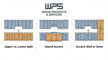
That clarity comes down to one principle: contrast + balance. One tone anchors the space (typically the darker, lower element), while the other brightens or defines it. The three most common layout strategies are:
- Upper vs. lower split — different colors on wall and base cabinets
- Island accent — a contrasting color isolated to the island
- Accent wall or zone — one run of cabinets treated as a focal point
Two-tone cabinets can make a space look larger by adding visual depth that a single-color kitchen lacks. They also define zones in open-concept layouts without adding clutter. On the investment side, minor midrange kitchen remodels recoup approximately 113% of their cost at resale, making two-tone cabinetry a practical upgrade, not just an aesthetic one.
20 Two-Tone Kitchen Cabinet Ideas
These 20 combinations are organized into five design-style categories so you can quickly find the look that fits your home's existing aesthetic and personal taste.
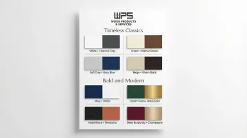
Timeless Classics
White + Charcoal Gray
Crisp white uppers with charcoal lowers is the most universally flattering pairing—works in modern, transitional, and farmhouse kitchens alike. Charcoal grounds the space without the starkness of black, while white uppers keep things airy and clean.
Navy Blue + Crisp White
A perennially popular duo that balances sophistication with brightness. Navy lowers add depth and a nautical or traditional feel. White uppers prevent the space from reading heavy, which is why this pairing has held steady across coastal, preppy, and transitional design movements for decades.
Matte Black + Bright White
High-contrast and graphic (often called the "tuxedo kitchen"). Black anchors the lower zone with drama and practicality (hides wear), while white uppers maintain brightness. Best suited to modern or contemporary kitchens where bold statements feel at home.
Warm Cream + Natural Wood
Creamy or off-white uppers paired with a warm wood tone on lowers or the island. One of the most inviting, timeless combos: the wood brings organic texture, and the cream keeps the palette from tipping cold or clinical.
Earthy & Nature-Inspired
Forest Green + Natural Wood
Deep green on the island or lower cabinets paired with natural wood uppers channels a biophilic, organic aesthetic. Works beautifully with stone countertops and black or brass hardware. Green is the most popular color choice for the second year running, with 76% of designers selecting it.
Sage Green + Off-White
Softer and more versatile than emerald or forest green, sage reads as a warm neutral that happens to have color. Paired with off-white or cream, this combo suits cottage, farmhouse, and transitional kitchens. Small spaces benefit from its restraint, and the color still reads as intentional rather than default.
Greige + White Oak
Greige (gray-beige) combined with white oak delivers a warm Scandinavian or modern farmhouse look. Both tones are neutral enough to blend with almost any countertop, backsplash, or flooring. The result is a relaxed, lived-in aesthetic built around natural materials rather than color contrast.
Teal + Natural Wood
Teal brings energy and a mid-century or coastal character without the commitment of navy. Natural wood tones temper its vibrancy with warmth, making it a strong fit for eclectic or bohemian kitchens where the design leans expressive.
Bold & Modern
Dark Gray + Light Gray
Using two saturations of the same color creates subtle but sophisticated depth. This tonal approach reads as intentional and refined, ideal for homeowners who want contrast without sharp color breaks.
Emerald Green + Bright White
Emerald is a rich, jewel-toned statement; white uppers let it command the room without overwhelming it. Best used on lower cabinets or the island where the bold color can anchor rather than enclose.
Navy + Gray-Stained Wood
A darker, more complex take on navy combinations. The gray-stained wood adds natural texture and softens what would otherwise be an all-cool palette. Suits contemporary or industrial-leaning kitchens.
Charcoal + Warm Wood
Pairing the coolness of charcoal with warm wood tones creates a balanced, high-contrast modern kitchen. Works especially well when the wood tone is used for open shelving or an island base to break up heavy cabinetry.
Soft & Subtle
Blue-Gray + White
For homeowners who want the quiet character of blue without committing to navy or teal. Blue-gray lowers and white uppers create a calm, coastal-adjacent look that pairs well with marble or light stone countertops.
Powder Blue + Light Wood
A vintage-leaning, nostalgic pairing that feels polished and airy. Powder blue adds gentle color; light wood keeps it from tipping into themed territory.
Blush + White
Blush lowers and white uppers deliver a soft, romantic look, well suited to cottage, French country, or modern-eclectic kitchens. Gold fixtures and open wood shelving elevate the combination without making it feel saccharine.
Lilac + Cream
An unexpected but surprisingly elegant pairing for homeowners who want quiet originality. The lilac adds a faint pop of color while the cream grounds and softens, landing in a relaxed, vintage-modern register.
Unexpected & Trending
Plum + Cream
A moody, luxurious combination that makes a statement without going full black. Plum on the lowers reads as sophisticated and bold, while cream neutralizes its intensity and keeps the room livable.
Two-Tone Wood
Combining two wood species or stain tones (such as white oak uppers and walnut lowers) is one of the most craft-forward approaches. The contrast is subtle but textured, ideal for kitchens that prioritize natural materials and artisan quality.
Deep Red / Burgundy + Warm White
Rich, warm, and dramatic: burgundy or deep terracotta on lower cabinets or the island, paired with a warm white, creates a striking focal point. Works well in bold traditional or maximalist kitchens.
Black + Warm Wood
Matte black lowers or island with warm wood-tone uppers. This pairing bridges industrial and organic: sleek and modern in structure, warmed by the natural grain. Increasingly popular in contemporary kitchens.
Design Rules for Two-Tone Kitchen Cabinets
Placement: Darker Down, Lighter Up
The foundational rule: darker tones on lower cabinets, lighter tones on uppers. This works psychologically and visually—it grounds the space, draws the eye upward, and makes ceilings feel taller. Island accents and vertical zones follow the same logic and are equally valid approaches.
Check Undertones Before Committing
Color coordination hinges on undertones. A cool gray and a warm, yellow-toned white will clash even if both seem neutral on their own. Every paint color has a mass tone and an undertone; the closer the undertone is to the mass tone, the truer the color appears.
Test pairings using physical door swatches in your kitchen's actual light at different times of day. Colors read differently under yellow incandescent versus green fluorescent light.
Hardware as the Unifying Thread
Select the same finish for all hardware—matte black, brushed brass, polished nickel—across both cabinet colors. This creates cohesion and ties the two tones into one intentional design, rather than two separate choices. Even a single mismatched pull can break that cohesion.
Countertops, Backsplash, and Flooring Are Part of the System
When cabinet colors are bold, keep countertops, backsplash, and flooring in a neutral zone. Coordinate undertones across all surfaces—warm with warm, cool with cool. A white marble with gray veining will clash with warm honey oak floors and creamy cabinets.
Finish (Sheen) Matters as Much as Color
Finish affects how color reads in light, how durable the surface is, and the overall feel of the space:
- Semi-gloss: Highly durable, resists moisture, easiest to wipe down—ideal for high-traffic lower cabinets
- Satin: Strong middle ground, resists everyday messes well—works for transitional kitchens and uppers
- Matte: Hides fingerprints well, but less resistant to scratches—best for low-traffic areas
Waterborne alkyd enamels cure to a hard, furniture-like finish in about five days, combining the leveling quality of oil-based paint with easy cleanup. Mixing finishes intentionally (matte lowers, semi-gloss uppers) can create its own subtle contrast.
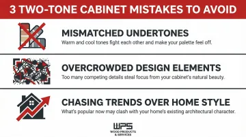
Common Mistakes to Avoid
Even a well-chosen two-tone palette can go wrong in execution. Watch out for these three common pitfalls:
- Mismatched undertones: Two colors may look complementary on a screen but clash in your actual kitchen if one runs warm and the other cool. Always test physical samples in your kitchen's light throughout the day before committing.
- Overcrowded design elements: Two-tone works because of restraint. Add a third accent color, a loud patterned backsplash, and a bold floor, and you lose the effect entirely. The cabinets are the focal point—supporting elements should stay calm.
- Chasing trends over your home's style: A high-contrast modern combo may look stunning in a contemporary loft but feel out of place in a traditional colonial home. Match your cabinet pairing to your home's architectural style and overall aesthetic—not just what's trending on Pinterest.
How to Choose the Right Combination for Your Kitchen
Start with the room's fixed elements—floor color, countertop material, wall color, natural light level. Then identify whether the kitchen needs more warmth, brightness, or depth. That alone narrows your options fast.
Kitchen Size and Light as Primary Filters:
- Lighter uppers and softer contrasts work best in small or low-light kitchens (blue-gray + white, greige + white oak)
- Bolder pairings suit large, well-lit spaces (charcoal + wood, emerald + white, black + white)
- Island accent colors help define the cooking zone in open-concept layouts without disrupting flow
North-facing light brings out cooler tones, so avoid anything with a blue or gray base if your kitchen faces north—use warm undertones instead. South-facing light is warm, so cool undertones (blue, green) balance it out.
If you're working with a custom cabinet maker, bring these light and size notes to your first consultation. Decisions about upper vs. lower color placement are much easier when your builder understands the room's specific conditions from the start. Quality Made Cabinets, based in Green Lane, PA, works through exactly this process with clients before any material is selected.
Frequently Asked Questions
Are two-tone kitchen cabinets still in style?
Yes. Two-tone kitchens remain one of the top design trends, with classic pairings like navy + white and wood + paint showing lasting appeal beyond any single trend cycle. The approach itself—contrast and depth—is a timeless design principle.
What is the rule for two-tone kitchen cabinets?
The most widely used guideline is placing the darker color on lower cabinets to ground the space and the lighter color on uppers to reflect light and create height. This is a starting point, not a rigid rule—island accent or vertical zone approaches are equally valid.
What colors work best for two-tone kitchens?
Colors with compatible undertones work best—warm with warm, cool with cool. Navy + white, charcoal + white, and wood + paint are perennial favorites, while sage green and cream are among the most popular current choices.
What are popular two-tone cabinet combos?
The most searched pairings are white + charcoal gray, navy + white, white + natural wood, black + white, and forest green + natural wood. Your kitchen's size, style, and lighting will point you toward the right fit.
What kitchen cabinet color is outdated?
The uniform all-white kitchen with stark, cool-toned white on every surface is increasingly seen as dated—71% of designers report clients now prefer colorful, personalized kitchens. Single-color honey oak stain from the 1990s is also commonly cited as outdated.
Can kitchen cabinet doors be a different color than the frame?
Yes. Contrasting door panels and frames is a recognized two-tone technique—black frames with white door panels, for example. Simple hardware lets the frame-panel contrast take center stage.