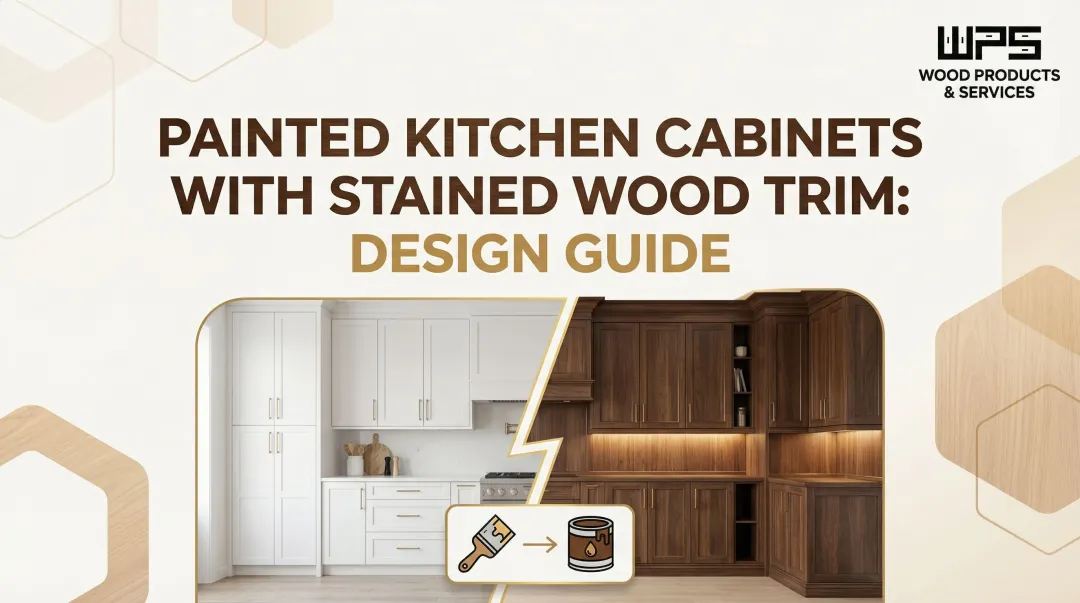
Introduction
Choosing wall colors for a white-cabinet kitchen often feels overwhelming. Many homeowners get stuck on safe, predictable neutrals — worried that anything bolder will clash or feel dated. White cabinets reflect light and adapt to virtually any palette, from warm taupes to deep navy — which is exactly what makes the choice so hard to narrow down.
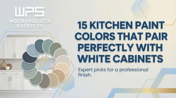
This guide covers 15 curated paint colors organized across four mood categories — warm neutrals, cool and crisp tones, earthy accents, and bold dramatic statements. Each pick includes guidance on lighting, layout, and finish so you can make a confident choice for your space.
TLDR
- White cabinets pair with everything from warm greiges to deep dramatic hues
- Your white's undertone and lighting conditions determine which colors actually work
- Warm neutrals like Agreeable Gray offer safe contrast; bold greens and navies add depth
- Always test samples in your specific lighting before committing
- Cabinet finish and wood quality affect how paint colors read in the final space
What to Know Before Picking a Kitchen Paint Color
Understanding LRV (Light Reflectance Value)
LRV measures how much light a color reflects, ranging from 0 (absolute black) to 100 (pure white). Colors with LRV above 50 reflect more light than they absorb, keeping kitchens feeling open and airy. Anything below 50 soaks up light, creating a more intimate atmosphere.
For smaller or darker kitchens, stick to higher-LRV colors (65-85) that bounce light into corners. Larger, well-lit spaces can handle lower-LRV dramatic hues without feeling closed in.
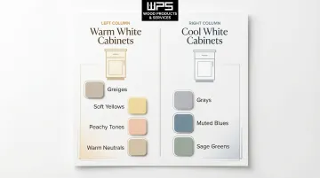
Match Your White Cabinet Undertones
Not all whites are created equal. Your cabinets lean either warm (creamy, ivory tones with red, orange, or yellow undertones) or cool (bright, icy tones with green, blue, or violet undertones).
- Warm white cabinets pair best with greiges, soft yellows, peachy tones, and warm neutrals
- Cool white cabinets work better with grays, muted blues, and sage greens
Consider Your Kitchen's Lighting
Room orientation affects how paint reads throughout the day. North-facing kitchens receive cool, bluish light that intensifies cool paint tones — balance this with warm neutrals or colors with warm undertones. South-facing rooms get consistent, warm amber light that pairs well with whites containing hints of gray or blue.
Artificial lighting matters too. Incandescent bulbs cast yellow light that intensifies warm colors but dulls cool ones. Fluorescent and LED lighting skews cool, amplifying blues and greens while muting warmer tones.
Test Before You Commit
What looks perfect on a 2-inch paint chip can look completely different on your walls at 6pm under LED lighting. Peel-and-stick paint samples from services like Samplize provide real paint swatches you can move around your kitchen, observing how the color shifts from morning to evening.
Color coordination becomes even more important when you're planning new cabinetry at the same time. Quality Made Cabinets builds custom white cabinets to order, so you can match the cabinet finish to your chosen wall color from the very beginning rather than working backward from an existing white.
15 Kitchen Paint Colors That Pair Perfectly With White Cabinets
These 15 colors are organized into four style categories — warm neutrals, cool and calming shades, warm and earthy tones, and bold dramatic choices — so you can navigate directly to your preferred aesthetic.
Warm Neutrals
1. Agreeable Gray (Sherwin-Williams SW 7029)
This warm greige prevents all-white kitchens from feeling flat. With an LRV of 60.386 and beige undertones, Agreeable Gray adds subtle depth without overwhelming white cabinets.
It's especially suited for open-concept homes where kitchen walls flow into living areas. Designers favor it for its adaptability across lighting conditions and its ability to make white cabinets pop without pulling attention from the cabinetry.
2. Edgecomb Gray (Benjamin Moore HC-173)
Sitting between beige and gray, Edgecomb Gray brings subtle warmth with an LRV of 63.09. This soft greige works across modern farmhouse and traditional styles, adapting as natural light shifts throughout the day.
It provides just enough contrast to highlight white cabinetry without competing for attention — a reliable pick for warm-toned countertops and natural wood flooring.
3. Shoji White (Sherwin-Williams SW 7042)
This warm, creamy off-white has an LRV of 74.345, creating a cozy, tonal contrast against bright white cabinets. Its subtle warmth makes it ideal for kitchens with warm wood floors, countertops with warm veining, or brass fixtures.
Shoji White delivers a monochromatic look that feels inviting rather than stark, perfect for those who love the all-white aesthetic but want a touch more warmth.
4. Pale Oak (Benjamin Moore OC-20)
With a taupe-pink undertone and LRV of 68.64, Pale Oak brings soft warmth that reads as neither beige nor gray. This versatile shade comes alive in kitchens with abundant natural light, where its subtle undertones add depth without feeling heavy.
It's an excellent choice for homeowners seeking a neutral that feels slightly more sophisticated than basic beige.
5. Perfect Greige (Sherwin-Williams SW 6073)
This balanced warm beige has an LRV of 41.654, keeping kitchens feeling inviting and grounded. It provides subtle contrast that lets white cabinetry stand out while adding warmth — particularly effective in kitchens with matte black or oil-rubbed bronze hardware.
Ideal for those who love neutrals but want a touch more color than near-whites provide.
Cool and Calming Shades
6. Sage Green (e.g., Mizzle by Farrow & Ball)
Soft sage green like Mizzle is a muted earthy shade that pairs effortlessly with white cabinets by evoking nature and calm. Its muted quality avoids the intensity of brighter greens, and can make small kitchens feel slightly more spacious.
This color trend continues to gain momentum, with the NKBA reporting green as the most popular kitchen color choice among designers.
7. Muted Blue (e.g., Cottage Door by Valspar)
This rich, toned-down blue has an LRV of 26.0, adding color and contrast without overwhelming. Muted blues — neither too bright nor too dark — are ideal for those who want a bold choice that still feels livable.
It works especially well in kitchens with cool white cabinets and chrome or stainless steel fixtures.
8. Pastel Blue (e.g., Dayflower by Behr)
This soft, soothing pale blue has an LRV of 58, adding just the right amount of color for a serene, airy feel. Nearly all pastel shades work beautifully with white cabinets, and this shade shines in kitchens with good natural light.
It creates a spa-like atmosphere — especially effective paired with brushed nickel hardware and marble countertops.
9. Balboa Mist (Benjamin Moore 1549)
This soft gray with LRV 65.53 has a subtle lavender undertone that gives it a dreamy, refined feel. It's a step above white but not quite a committed gray, working well alongside white cabinets in both modern and traditional spaces.
Pair it with natural textures or bold accents to create depth and visual interest.
Warm and Earthy Tones
10. Soft Yellow (e.g., Honeypot by Sherwin-Williams)
Muted, soft yellow like Honeypot adds warmth and cheer without the flat brightness of citrus yellows. The sunlit warmth works especially well in north-facing kitchens that lack natural light, where it compensates without feeling forced.
11. Dusty Pink (e.g., Sulking Room Pink by Farrow & Ball)
Dusty pink like Sulking Room Pink is a bold-yet-muted color that looks stunning against white cabinets — warm and distinctive without veering into candy-pink territory.
This shade works especially well in kitchens with brass or copper hardware, creating a warm, contemporary aesthetic.
12. Soft Peach (e.g., Porcelain Peach by Behr)
Peach with an LRV of 72 is a surprising but sophisticated wall color that creates effortlessly stylish kitchens against white cabinets. Its warm, skin-toned base adds richness while keeping the overall palette light and airy. It pairs particularly well with warm-white or cream cabinet finishes rather than stark bright white.
Bold and Dramatic Choices
13. Dark Green (e.g., Gallery Green by Sherwin-Williams)
Dark green like Gallery Green is an elegant, nature-inspired choice that creates calming yet sophisticated kitchens. Deep greens as accent walls or full wall color create striking focal points against white cabinets.
This shade also highlights architectural details like crown molding or distinctive cabinet shapes, adding visual depth.
14. Deep Teal or Navy (e.g., Dark Teal by Benjamin Moore)
Deep teal or navy adds drama and depth to all-white kitchens. Used on an accent wall or single feature wall, this shade creates striking contrast that adds visual interest without consuming the whole space.
It reads especially well alongside polished chrome fixtures and white quartz countertops, where the contrast feels intentional rather than stark.
15. Black or Near-Black (e.g., Pitch Black by Farrow & Ball)
A black accent wall like Pitch Black is the most dramatic pairing with white cabinets. The high contrast creates depth, sophistication, and a modern or minimalist edge.
Ideal for those who don't want color but still want to make a bold statement, black works especially well in kitchens with stainless steel or matte black fixtures.
How to Pick the Right Color for Your Specific Kitchen
Match Color to Kitchen Size and Ceiling Height
Smaller kitchens benefit from higher-LRV, lighter colors (65-85) that reflect light and create a sense of space — think sage green, pastel blue, Shoji White, or Pale Oak. These shades bounce light deeper into corners, making compact kitchens feel broader.
Larger kitchens can handle deeper, more saturated hues like dark green, navy, or near-black without feeling closed in. The extra square footage allows dramatic colors to create focal points without overwhelming.
To create the illusion of higher ceilings, consider painting the ceiling a diluted version of your wall color — approximately 80% white to 20% wall color.
Coordinate with Countertops, Backsplash, and Flooring
Matching the undertone of your wall paint to the dominant undertone of surrounding materials creates a cohesive result. Keep undertones consistent across major surfaces — stick to either warm tones (creams, beiges) or cool tones (grays, crisp whites).
Warm wood floors or creamy countertops call for warm-toned wall colors like Agreeable Gray, soft peach, or dusty pink. Gray stone countertops pair better with cool or neutral hues like Balboa Mist, sage green, or muted blue.
Factor in Hardware and Fixtures
Hardware finishes guide color direction naturally. A quick reference for common finishes:
- Brass and gold — lean warm; pair best with warm neutrals and earthy tones
- Matte black — lean cool; complement grays, deep blues, and dramatic darks
- Chrome and nickel — lean cool to neutral; work well with crisp whites, soft grays, and muted blues
Getting the hardware, paint, and cabinet finish all pulling in the same direction is what separates a polished kitchen from one that feels slightly off. For homeowners tackling a full renovation, Quality Made Cabinets builds white cabinets in finishes matched to your chosen color scheme — so the coordination between cabinet and wall color is resolved before a single drop of paint goes up.
Conclusion
White kitchen cabinets are one of the most versatile design choices available, and the 15 colors covered here — from warm neutrals to bold darks — show how many directions you can take a white kitchen. The best pairing reflects your personal style, suits your kitchen's lighting and layout, and creates the feeling you want when you walk into the room.
Test samples before committing, and check them at different times of day — natural light and artificial light can shift a color significantly. If you're considering new or updated cabinetry, Quality Made Cabinets offers consultations to help you choose the right cabinet finish — the foundation that every great paint pairing is built on.
Frequently Asked Questions
What is the best color to paint a kitchen with white cabinets?
The right color depends on your kitchen's size, lighting, and personal style. Warm neutrals like Agreeable Gray or Edgecomb Gray work in nearly any kitchen, while bold options like dark green or navy suit those who want stronger contrast.
What colors look best with white cabinets?
Warm greiges and neutrals are reliably timeless, while sage green and muted blue add calm without overpowering the space. Dark green and black create striking contrast. Let the undertone of your white cabinet — warm or cool — guide which color family to explore first.
How can I add color to a kitchen with white cabinets?
Start with a single accent wall in a bolder color, or choose a medium-saturated shade from the warm/earthy or cool/calming categories. Color can also be layered through hardware, backsplash tile, and accessories without committing to a full paint change.
What's the most popular kitchen cabinet color right now?
White remains the most popular cabinet color overall for its versatility and timeless appeal, though warmer off-whites, creamy whites, and soft greens are trending as alternatives. In 2026, wood tones have also gained significant popularity.
What color paint is good for a small kitchen?
High-LRV colors — soft sage green, pastel blue, or warm neutrals like Shoji White or Pale Oak — reflect light and make small kitchens feel more open. Reserve dark or heavily saturated colors for a single accent wall if you want depth without closing in the space.
What is the most popular white cabinet paint color?
Sherwin-Williams Alabaster, Pure White, and Benjamin Moore White Dove consistently rank among the most popular choices for their warm, balanced tones. The right white ultimately comes down to the undertone of your surrounding materials and how much natural light your kitchen receives.